
How to ensure consistent color grading for fashion campaigns?
In my fifteen years navigating the intricate world of fashion photography, I've seen firsthand that color consistency isn't merely a preference; it's the bedrock of a successful campaign. A brand's visual identity, its very essence, hinges on a unified aesthetic across all touchpoints, from print ads to social media feeds. This uniformity builds trust and reinforces brand recognition.
The journey to impeccable color consistency begins long before the shutter clicks. It's a strategic undertaking rooted firmly in the pre-production phase, where we define the visual language. Neglecting this foundational step is, in my experience, a common pitfall that leads to endless headaches and costly revisions down the line.
Start by establishing a definitive color palette and mood board with the creative director and client. This isn't just about aesthetics; it's a technical blueprint. Every shade, every hue, must be agreed upon and documented, providing a universal reference for the entire team, from the stylist to the retoucher.
Crucially, ensure all monitors involved in the post-production pipeline are professionally calibrated to a consistent standard, ideally Rec. 709 or sRGB for most digital deliverables. Without this, you're essentially grading blind, and what looks perfect on one screen might appear wildly off on another. This is non-negotiable.
On set, maintaining consistent lighting conditions is paramount. Even subtle shifts in light temperature or direction can drastically alter how colors are captured. I always advocate for meticulous light metering and, where possible, using controlled studio environments or carefully managed natural light scenarios.
Employ a rigorous white balance protocol. While RAW files offer flexibility, getting white balance as accurate as possible in-camera reduces post-production workload and minimizes potential color shifts. Using a gray card or a color checker like the X-Rite ColorChecker Passport for reference shots in each lighting setup is a practice I swear by.
These reference shots, taken under identical lighting as your fashion images, become your "north star" in post-production. They provide an objective baseline for color accuracy, allowing retouchers to correct for any subtle shifts introduced by lenses or ambient light variations, ensuring skin tones and fabric colors remain true.
Once the shoot wraps, the battle for consistency moves to the editing suite. This phase demands an equally rigorous approach, transforming individual images into a cohesive visual narrative. In my workflow, I break this down into several critical stages to prevent any color drift:
-
Establish Master Reference Files: Start by meticulously grading your "hero" shots, the images that best encapsulate the campaign's intended mood and color palette. These become your absolute benchmark. Every subsequent image from the campaign must be graded in direct relation to these masters, preventing any subjective drift and ensuring a unified aesthetic.
-
Develop Standardized Presets or Custom LUTs: This is a non-negotiable step for large campaigns or when collaborating with multiple retouchers. A well-crafted LUT (Look-Up Table) or preset can apply the primary color adjustments consistently across hundreds of images, acting as a foundational layer. This frees retouchers to focus on the nuanced, image-specific details without re-inventing the core look each time.
-
Implement an Iterative Feedback Loop: Communication is key. Instead of vague comments, establish a precise feedback protocol. Referencing specific images, color values, or even hex codes ensures that adjustments are objective and targeted. For example, "The blues in image #123 need to be cooled by 5 points, closer to the tone in the approved master file #001" is far more effective than "make the blues better."
-
Conduct Multi-Device Quality Assurance (QA): The final, indispensable step is a thorough QA review. This involves scrutinizing all graded images on multiple professionally calibrated screens – including desktop, laptop, and mobile devices – to catch any subtle anomalies that might appear differently across various display technologies. A fresh pair of expert eyes, often from the creative director, is invaluable here.
"Consistency isn't about stifling creativity; it's about channeling it with precision. For a fashion campaign, color consistency is the silent promise you make to your audience that your brand is reliable, refined, and authentic."
Understanding the Root of the Problem: Why Does Inconsistent Color Grading Happen?
In my fifteen years overseeing high-stakes fashion campaigns, I've observed that inconsistent color grading is rarely a single, isolated error. Instead, it's often the cumulative result of several interconnected issues, each capable of derailing a campaign's visual integrity and, ultimately, its brand message.
One of the most insidious culprits, because it's so often overlooked, is the uncalibrated monitor. Imagine trying to paint a masterpiece while wearing color-tinted glasses; your perception of true color is fundamentally skewed from the outset.
- Varied Display Hardware: Different monitors, even within the same brand, have unique display characteristics. Without calibration, what looks perfectly neutral on one screen might appear greenish or magenta on another.
- Environmental Lighting: The ambient light in a workspace significantly impacts how we perceive colors on a screen. A bright, cool-toned office will make colors appear warmer than they are, while a dim, warm-toned room will do the opposite.
- Infrequent Calibration: Monitor calibration isn't a one-and-done task. Displays drift over time due to use and age, requiring regular recalibration (ideally monthly) to maintain accuracy.
Another significant root cause stems from inconsistencies at the very point of capture. Even with meticulous photographers, the dynamic nature of fashion shoots often introduces subtle shifts that become glaring problems in post-production if not managed proactively.
- Dynamic Lighting Conditions: Shooting across various locations, different times of day, or with mixed natural and artificial light sources inevitably introduces variations in color temperature and tint.
- Automatic Camera Settings: Relying on auto white balance or default camera profiles can lead to slight but noticeable color shifts between frames, especially when shooting rapidly or in changing environments.
- Lens and Camera Variations: Different lenses, and even different camera bodies, can render colors slightly differently, creating a patchwork effect across a campaign if not accounted for during the shoot and in post.
Beyond technical hurdles, a fragmented workflow often guarantees inconsistent results. When multiple hands touch a campaign's imagery without a unified vision or rigorous controls, subjective interpretations inevitably creep in, eroding visual cohesion.
- Lack of a Master Reference: Without a single, approved reference image or a bespoke Look-Up Table (LUT) established at the outset, each retoucher or colorist is left to interpret the desired aesthetic independently.
- Multiple Retouchers/Colorists: It's common for large campaigns to involve several post-production artists. Each artist brings their own eye, experience, and even their own monitor setup, making uniformity a significant challenge.
- Subjective Interpretation of Briefs: Terms like "warm," "cool," "moody," or "vibrant" are open to broad interpretation. Without concrete visual examples and objective targets, consistency is left to chance.
A critical, yet often underestimated, factor is a breakdown in communication between all stakeholders. The creative director, photographer, retoucher, and brand marketing team must speak a common visual language and agree on the final aesthetic from the project's inception.
In my experience, the most successful campaigns are those where the color grading vision is not just understood, but *felt* by every individual in the workflow, from the first click of the shutter to the final export.
Finally, a misunderstanding or misapplication of color spaces can quietly sabotage even the most carefully graded images. What looks perfect in a wide-gamut editing environment might appear dull and desaturated when viewed in a standard web browser or printed with an incorrect profile.
Ultimately, inconsistent color grading is a multifaceted problem stemming from a confluence of technical oversights, workflow deficiencies, and communication gaps. Addressing it requires a holistic approach that tackles each of these foundational issues, ensuring every image resonates with the campaign's intended visual narrative.
Lack of Clear Color Grading Requirements
One of the most insidious yet common pitfalls in fashion photography post-production is the absence of clearly defined color grading requirements.
In my experience, this oversight single-handedly costs campaigns countless hours, extensive re-edits, and often results in a final output that misses the mark on brand vision.
Without precise guidelines, the interpretation of terms like 'warm,' 'vibrant,' or 'moody' becomes entirely subjective, leading to a frustrating back-and-forth between the photographer, retoucher, and creative director.
This lack of a shared visual language inevitably delays project timelines and inflates budgets, turning what should be a creative process into a battle of personal preferences.
A fragmented approach to color grading can significantly dilute a brand's visual identity, creating inconsistency across different campaign assets or even between shots within the same series.
Your brand's aesthetic is its signature; color is a foundational element of that signature, and any deviation weakens its impact.
To circumvent this, establishing robust color grading requirements *before* any post-production work begins is non-negotiable.
This process demands a collaborative effort during pre-production, ensuring all stakeholders are aligned on the desired aesthetic and technical parameters.
When defining these requirements, ensure you cover:
- Visual References: Compile a comprehensive mood board with specific image examples that exemplify the desired color palette, contrast, and overall tone. Annotate these references to highlight precise elements.
- Brand Guidelines Integration: Integrate the brand's official color palette, often including hex codes or Pantone references, to ensure fidelity, especially for product shots or brand-specific elements.
- Technical Specifications: Specify desired color space (e.g., sRGB, Adobe RGB, Rec. 709), white balance targets, acceptable highlight/shadow clipping thresholds, and grain/noise expectations.
- "Golden Image" Benchmarks: Select a few hero shots from the campaign, grade them to perfection as approved by the creative director, and use these as definitive benchmarks for the entire series. These become your visual "north star."
- Subjective-to-Objective Translation: Translate abstract terms into concrete instructions. For example, 'warmer skin tones' might become 'add +10 to yellows in the mid-tones and decrease magenta by -5,' providing measurable targets.
Think of it like a chef needing a precise recipe, not just a vague request to "make it taste good." Without a recipe, the outcome is left to chance and individual interpretation.
In fashion, your color grade *is* the blueprint for emotional resonance and brand recognition, and it must be meticulously crafted.
In my fifteen years of navigating high-stakes fashion campaigns, I've learned that the clarity of your color brief directly correlates with the efficiency and success of your post-production. Ambiguity is the enemy of excellence.
By investing time upfront in defining these parameters, you streamline the revision process, empower your retouchers with a clear roadmap, and ultimately achieve a more cohesive and impactful final product.
This proactive approach not only saves precious budget and time but also preserves the creative integrity and distinct visual voice of your campaign.
Communication Gaps in Color Approval Workflow
In my fifteen years navigating the intricate world of fashion campaigns, I've observed that the most brilliant color grading work can often be derailed not by technical inadequacy, but by fundamental **communication gaps** in the approval workflow. This isn't just about misinterpretations; it's a systemic issue that costs time, money, and creative integrity.A common pitfall I consistently encounter is the **vague initial brief**. When the creative director or client fails to articulate their vision with specific visual references or emotional descriptors, the colorist is left to guess. This is akin to building a house without blueprints; the foundation is shaky from the start.
The inherent **subjectivity of color perception** is another significant hurdle. What one person describes as "warm" another might perceive as "too yellow." This is further complicated by uncalibrated screens, varying ambient light conditions, and personal preferences, making objective feedback incredibly difficult.
I've lost count of the times I've received feedback like "make it pop" or "it needs more energy." While well-intentioned, such **ambiguous feedback** offers no actionable direction for a colorist. It forces a cycle of trial and error, eroding efficiency and often leading to frustration on both sides.
"The language of color is universal, but its interpretation is deeply personal and technically complex. Bridging this gap requires more than just good intentions; it demands a structured approach to dialogue."
The technical disconnect is also a major silent killer. Imagine a client approving a look on an uncalibrated laptop screen under fluorescent office lights, only to be horrified when they see the proof on a professionally calibrated monitor or in print. This scenario, unfortunately, is not uncommon and highlights the critical importance of a **standardized viewing environment**.
Another prevalent issue is the **fragmented communication channel**. Feedback dispersed across emails, WhatsApp messages, phone calls, and even sticky notes is a recipe for disaster. Important instructions get lost, conflicting revisions are made, and tracking the evolution of the color grade becomes a logistical nightmare.
Furthermore, the "too many cooks" syndrome often plagues larger campaigns. When multiple stakeholders—creative directors, brand managers, marketing teams, and even product designers—all weigh in with their individual color preferences, the colorist is left to synthesize a cacophony of **conflicting directives**. Without a single, designated decision-maker, the approval process grinds to a halt.
In my experience, these communication breakdowns directly contribute to:
- Exorbitant revision cycles: Each round of unclear feedback or technical mismatch adds hours, sometimes days, to a project timeline.
- Budget overruns: Time is money, and excessive revisions translate directly into increased costs, impacting profitability for both the client and the creative team.
- Creative dilution: The original artistic intent can be compromised when chasing vague feedback, leading to a watered-down or inconsistent final product.
- Client dissatisfaction: Misunderstandings and delays inevitably lead to frustration, potentially damaging long-term client relationships.
Addressing these gaps requires a proactive and systematic approach, recognizing that stellar color grading is not just about technical prowess, but also about mastering the art of clear, concise, and consistent communication.
Step-by-Step: A Practical Framework to Ensure Consistent Color Grading
Achieving consistent color grading across an entire fashion campaign is not merely a technical task; it's an art form underpinned by rigorous methodology. In my fifteen years in this industry, I've seen firsthand how a lack of consistency can undermine a brand’s visual identity, dilute its message, and ultimately, cost a client dearly in re-shoots or missed opportunities. This framework is designed to prevent those pitfalls.
The core principle here is establishing a "Master Reference" early on and meticulously adhering to it. Think of it like a symphony orchestra: every instrument must be perfectly in tune and play from the same score to create a harmonious whole. In fashion photography, your "instruments" are individual images, and the "score" is your defined color aesthetic.
"Consistency isn't just about matching hues; it's about maintaining the emotional resonance and brand integrity across every single visual touchpoint."
Here’s a practical, step-by-step approach I've refined over countless campaigns:
-
Pre-Production Color Strategy & Communication: This is where the foundation is laid. Before a single shutter clicks, a detailed discussion with the client, art director, and stylist is paramount. We define the campaign's overall mood, desired color palette, and specific brand colors that must be meticulously preserved.
-
Mood Board & Swatches: Go beyond digital. Request physical fabric swatches for key wardrobe pieces or product samples. This tactile reference is invaluable, as screen calibrations can vary.
-
Emotional Brief: Document not just *what* colors, but *how* they should feel. Is it vibrant and energetic, or muted and sophisticated? This informs the grading style.
-
Lighting Plan: Discuss how lighting choices on set will support the desired color outcome. Consistent lighting is the bedrock of consistent color.
-
-
On-Set Calibration & Capture Protocols: What happens in camera is 80% of the battle. You can’t grade what isn’t captured correctly.
-
Color Reference Targets: I insist on using an X-Rite ColorChecker Passport or similar color chart in the first frame of every new lighting setup or wardrobe change. This provides an objective reference for post-production.
-
Grey Card for White Balance: Shoot a grey card under the same lighting conditions. This ensures a neutral starting point for white balance adjustments in RAW processing.
-
Calibrated Monitoring: Ensure your on-set monitor (and ideally, your client monitor) is professionally calibrated. What you see is what you get, or at least, what you *should* be getting.
-
Shoot RAW, Always: This provides the maximum flexibility for color correction and grading without destructive compression, preserving detail and dynamic range.
-
-
Establishing the "Hero" Image & Master Grade: Once the shoot is complete, the crucial next step is to select a "hero" image – one that perfectly encapsulates the campaign's vision and features key products or models.
-
Collaborative Grading: Grade this hero image in close collaboration with the art director and client. This becomes your definitive visual benchmark.
-
Create a LUT/Preset: Once the master grade is approved, save it as a custom LUT (Lookup Table) or a development preset (e.g., in Lightroom or Capture One). This encapsulates all the color, tone, and contrast adjustments.
-
Reference Files: Export multiple versions of this hero image with the approved grade, including specific RGB/CMYK values for critical brand colors, for future reference.
-
-
Batch Processing & Consistency Checks: This is where the power of your master grade comes into play.
-
Apply Master Grade: Apply your carefully crafted LUT or preset to the entire set of images. Most professional software allows for batch application.
-
Visual Scan for Outliers: Systematically review the images. Use grid views or comparison modes to quickly spot any images that deviate significantly from the master. Look for inconsistencies in skin tones, product colors, or overall mood.
-
Targeted Adjustments: For any outliers, make precise, localized adjustments. A common mistake I see is applying the master grade blindly and expecting perfection; ambient light shifts or slight exposure variations will always require minor tweaks.
-
-
Fine-Tuning & Quality Control: The devil is in the details, especially in high-stakes fashion campaigns.
-
Skin Tone Fidelity: Always prioritize natural and consistent skin tones. Use tools like hue/saturation masks or selective color adjustments to fine-tune without affecting the overall grade.
-
Brand Color Accuracy: Cross-reference against your physical swatches and documented color values. Even slight shifts in a brand's signature red or blue can be jarring.
-
Soft Proofing: If images are destined for print, soft-proof them with the correct ICC profile for the intended output. This helps predict how colors will render on paper versus screen.
-
Team Review: A fresh pair of eyes from a trusted colleague or the art director can catch subtle inconsistencies you might have overlooked.
-
-
Archiving & Documentation: This step is often neglected but is absolutely critical for long-term consistency and future projects.
-
Save All Presets/LUTs: Store your campaign-specific LUTs, presets, and color profiles in a well-organized archive.
-
Detailed Notes: Document every aspect of the color grading process: software used, specific settings, and any unique challenges or solutions. This forms a valuable knowledge base.
-
Future-Proofing: This documentation ensures that if the brand needs similar imagery in the future, or if a different team member takes over, the visual consistency can be effortlessly maintained.
-
Step 1: Define Your Brand's Color Palette & Vision
Before you even think about sliders and curves, the absolute first step in achieving flawless color grading for any fashion campaign is to crystalize your brand's core color palette and overarching vision. This isn't just about aesthetics; it's the bedrock of your visual identity, dictating emotional resonance and market positioning.
In my experience, many brands rush into grading without this clarity, leading to an inconsistent visual language that dilutes their message. A truly successful campaign leverages color as a powerful, non-verbal communicator, establishing immediate recognition and fostering a deeper connection with the audience.
Defining your brand's color palette and vision involves a meticulous process. Here's how I advise my clients to approach it:
- Audit Existing Assets: Scrutinize your logo, website, previous campaigns, and even physical store aesthetics. What colors consistently appear? Are there underlying hues that define your brand's 'feel'?
- Understand Your Brand's Archetype: Is your brand luxurious and sophisticated (deep jewel tones, muted neutrals)? Playful and youthful (bright, saturated primaries)? Organic and earthy (natural, desaturated tones)? Your brand's personality dictates its color story.
- Target Audience & Emotional Impact: Research your demographic. What colors resonate with them? Do you want to evoke calm, excitement, trust, or innovation? Each color carries psychological weight that must align with your campaign's objectives.
- Campaign-Specific Mood & Narrative: While adhering to your core palette, each campaign might have a unique mood. A summer collection will naturally lean towards brighter, airier tones than an autumnal or winter one, even within the brand's established framework.
The "vision" extends beyond mere swatches; it encompasses the overall mood, the desired emotional response, and the story you want to tell. It’s about understanding the entire visual ecosystem the fashion will inhabit.
Consider the stark difference between a brand like Tiffany & Co. and its iconic "Tiffany Blue," instantly recognizable and synonymous with luxury, versus a brand like Nike, which employs a more dynamic, often vibrant palette to convey energy and performance. Both are deliberate, consistent, and deeply ingrained in their brand identities.
A common mistake I see is when brands allow trends to dictate their palette entirely. While staying current is important, your core color identity should be resilient. Trends should be *integrated* into your existing framework, not replace it entirely. Authenticity trumps fleeting fads every time.
The output of this crucial first step should be a clear, concise color grading brief. This document isn't just for the retoucher; it's a shared understanding for the entire creative team – from the photographer to the stylist to the marketing department.
Your brief should ideally include:
- Primary and secondary brand colors (with hex/RGB values).
- Desired overall mood/feeling (e.g., warm & inviting, cool & sophisticated, vibrant & energetic).
- Examples of approved imagery or mood board references that embody the desired color treatment.
- Specific instructions on skin tones, product accuracy, and background treatments.
By meticulously defining your brand's color palette and vision upfront, you're not just setting parameters; you're laying the groundwork for a cohesive, impactful, and ultimately, flawless campaign that resonates deeply with your audience. This strategic foresight saves countless hours in post-production and ensures every image reinforces your brand's unique identity.
Step 2: Calibrate Your Workflow: Monitors, Software, and Profiles
The journey to flawless color grading begins not in the software, but with the very tools you use to perceive color. In my experience, neglecting this foundational step is like a chef trying to perfect a dish in a kitchen with broken scales and inaccurate thermometers. You simply cannot achieve consistent, repeatable results without a properly calibrated setup.A color-managed workflow is the backbone of professional fashion photography. It ensures that the colors you see on your screen are as accurate as possible to the original capture and, crucially, to the final output, whether that's a high-gloss magazine print or a vibrant social media campaign.
The first and most critical component is your monitor. You simply cannot rely on factory settings or your eyes alone. Modern monitors, especially those designed for creative professionals, offer excellent color reproduction, but they still need regular calibration to maintain accuracy over time.
-
Invest in Quality Hardware: A good monitor is a non-negotiable asset. Look for IPS panels with wide gamut coverage (e.g., 99% Adobe RGB or DCI-P3). Brands like Eizo, BenQ, and Dell's UltraSharp series are common choices in the industry. These monitors provide the color depth and consistency needed for critical grading decisions.
-
Use a Hardware Calibrator: Forget software-only solutions or built-in monitor settings. You need a dedicated colorimeter or spectrophotometer (e.g., X-Rite i1Display Pro, Datacolor SpyderX Elite). These devices measure the actual light output of your screen and create an accurate ICC profile.
-
Set Calibration Targets: When calibrating, aim for industry-standard targets. In my studio, we typically set our monitors to a white point of D65 (6500K), a luminance of 100-120 cd/m², and a Gamma of 2.2. D65 simulates daylight, 100-120 cd/m² provides a comfortable viewing brightness for most editing environments, and Gamma 2.2 is standard for most operating systems and web content.
-
Calibrate Regularly: Monitor calibration isn't a one-and-done task. Monitors drift over time due to aging components and environmental changes. I recommend calibrating your primary grading monitor at least once a month, and ideally once every two weeks for critical projects.
“The most common mistake I encounter with aspiring fashion photographers is their reliance on an uncalibrated screen. It’s like painting in the dark and hoping for the right colors.”
Beyond the monitor itself, your software environment also plays a crucial role. Both your operating system and your editing applications need to be aware of and utilize your monitor's ICC profile. This ensures that the colors displayed are correctly interpreted and rendered.
-
Operating System Color Management: Ensure your operating system (macOS or Windows) is correctly loading and using your monitor's newly created ICC profile. This usually happens automatically after calibration, but it’s worth double-checking in your display settings.
-
Application-Specific Settings: Professional software like Adobe Photoshop, Lightroom, and Capture One are designed with color management in mind. They will typically default to using your system's monitor profile. However, it's essential to understand their internal working color spaces, such as sRGB, Adobe RGB (1998), or ProPhoto RGB. For fashion campaigns, I often start with ProPhoto RGB for its vast gamut, then convert to sRGB for web or CMYK for print at the final output stage.
-
Consistent Viewing Environment: Ambient light significantly impacts how you perceive colors. Work in a room with controlled, neutral lighting. Avoid direct sunlight or strong colored lights that can reflect off your screen or alter your perception. Gray walls and neutral desk surfaces are ideal.
Finally, understanding ICC profiles is paramount. An ICC profile is essentially a data file that describes the color characteristics of a device – be it a monitor, camera, scanner, or printer. It acts as a translator, ensuring that colors remain consistent across different stages of your workflow.
Your calibrated monitor will generate an ICC profile that Photoshop, for example, uses to correctly display your images. Similarly, when preparing files for print, you'll often soft-proof using a specific printer's ICC profile to simulate how the final image will look on paper.
In essence, calibrating your workflow is about establishing a chain of trust. Each link – your camera, your monitor, your software, and your output device – must speak the same color language. This meticulous setup is the bedrock upon which all successful and consistent color grading for fashion campaigns is built.
Step 3: Establish a Master Reference Image for Each Campaign
After establishing your foundational color profile, the next crucial step – and one I insist upon – is to **establish a master reference image** for your campaign. This isn't merely picking a favorite shot; it's about creating the visual anchor that will define the entire project's aesthetic. This master image serves as your irrefutable 'north star' for color, tone, and mood. Every subsequent image in the campaign, whether it’s for print, web, or social media, will be graded in direct relation to this approved benchmark. In my fifteen years working with top brands, I've seen firsthand how a lack of a clear reference leads to subjective interpretation and ultimately, inconsistent results. It's the most effective preventative measure against 'color drift' across a large set of images. Selecting this pivotal image requires a keen eye and strategic thinking. You need a shot that not only showcases the product beautifully but also encapsulates the campaign's overarching narrative, lighting scheme, and desired emotional resonance. Consider these critical elements when making your selection:- Representative Subject: Does it feature the hero product or talent in a characteristic way that embodies the campaign?
- Ideal Lighting: Is the lighting consistent with the campaign's intended style and flattering to both the subject and the colors present?
- Comprehensive Color Palette: Does it contain a good range of the campaign's key colors, including accurate skin tones, fabric hues, and background elements?
- Emotional Resonance: Does it immediately evoke the desired mood and align perfectly with the brand's identity?
- Technical Excellence: Is it sharp, well-exposed, and free from any distracting elements that could complicate the grading process?
"Think of your master reference image as the keystone in an arch. Without it, the entire structure of your campaign's visual identity risks collapsing into a disjointed collection of images. It's the singular point of truth for your entire color workflow."By dedicating time to meticulously establish and approve this single image, you are not just setting a standard; you are investing in efficiency, brand integrity, and the seamless visual narrative that is paramount to a successful fashion campaign.
Step 4: Implement a Standardized Grading Process and Presets
In my extensive experience guiding countless fashion campaigns, the transition from individual image adjustments to a cohesive collection truly hinges on **standardization**. This isn't just about efficiency; it's the bedrock of brand identity and visual storytelling across an entire collection, ensuring every image speaks the same sophisticated language. A common mistake I see emerging photographers make is approaching each image as a completely new grading challenge. While creativity is paramount, for a campaign with potentially hundreds or even thousands of images, this leads to inconsistency, endless revisions, and ultimately, a fractured visual narrative.Implementing a **standardized grading process** means defining a clear, repeatable sequence of adjustments that all images in a campaign will undergo. Think of it like a haute couture atelier’s meticulous pattern-making: there’s a foundational blueprint, allowing for tailored variations while maintaining the core design integrity.
To establish this process, consider these key phases:- Initial Calibration & White Balance: Ensuring a neutral, accurate starting point for every RAW file. This is non-negotiable for color fidelity.
- Exposure & Contrast Refinement: Bringing the image into the desired luminosity range, setting the mood before creative color is applied.
- Core Creative Look Application: This is where your campaign's signature aesthetic begins to take shape, often through a carefully developed preset.
- Targeted Adjustments (Skins, Fabrics, Backgrounds): Fine-tuning specific elements to ensure they pop or recede as intended, maintaining brand color accuracy on garments.
- Final Polish (Sharpening, Grain, Vignette): The subtle touches that elevate the image to a premium finish.
This systematic approach dramatically reduces subjective drift and ensures that whether you're grading 50 images or 500, the output remains visually coherent. It's about building a robust framework before you paint.
The true power of this standardized process is unleashed through the intelligent application of **presets**. Presets are not a magic bullet for perfect grading; rather, they are incredibly powerful starting points and consistency tools. I always tell my students: "A preset should get you 80% there, the final 20% is where your artistry truly shines."When developing presets for a campaign, you're essentially codifying your creative vision into reusable settings. This ensures that the specific tonality, contrast curve, and color shifts agreed upon with the creative director are applied uniformly across all assets, regardless of who is doing the grading.
Here’s how to effectively create and leverage presets:- Develop a Master Preset: Start with a hero image that embodies the campaign's desired look. Grade it meticulously, then save these settings as your foundational "Master Campaign Preset."
- Create Variations: Develop nuanced versions of your master preset. For instance, a "Master - Warm" for sunny outdoor shots, a "Master - Cool" for studio looks, or a "Master - High Key" for specific product shots. These are minor tweaks, not entirely different looks.
- Test Rigorously: Apply your presets to a diverse range of images from the shoot – different lighting conditions, skin tones, and garment colors. Adjust the preset until it performs consistently well across the board, requiring only minimal individual tweaking.
- Document Your Presets: Create a visual style guide or "look book" for your presets. This serves as a reference for your team, showing examples of when to use each preset and what the expected outcome is.
"In the fast-paced world of fashion photography, a well-crafted preset isn't a shortcut to mediocrity; it's a meticulously engineered tool that frees up your creative energy from repetitive tasks, allowing you to focus on the nuanced art of the final image."
By implementing a clear grading process and leveraging intelligently designed presets, you're not just saving time; you're building a scalable, reliable system for delivering **flawless, consistent color** that reinforces the brand's aesthetic across every single deliverable. It's the mark of a truly professional and future-proof workflow.
Step 5: Leverage Collaboration Tools for Feedback and Approval
Once you’ve meticulously crafted your initial color grade, the next critical hurdle is navigating the feedback and approval process. In my experience, this stage is where many campaigns either soar to success or get bogged down in endless revisions and miscommunications. Traditional methods, like emailing JPEGs back and forth with written notes, are simply inadequate for the nuanced demands of fashion photography.
I’ve witnessed firsthand how a lack of proper collaboration tools can lead to version control nightmares, missed feedback, and ultimately, a diluted creative vision. The subjective nature of color grading demands a highly precise and visual feedback loop, which generic communication platforms cannot provide.
This is precisely why leveraging dedicated collaboration tools is non-negotiable in today’s fast-paced campaign environment. These platforms are specifically designed to streamline the visual review process, ensuring clarity and efficiency across all stakeholders.
Consider the profound benefits that modern collaboration tools offer, transforming a chaotic process into a structured, productive workflow:
- Pinpoint Accuracy: Reviewers can annotate directly on the image, highlighting specific areas or even individual pixels, eliminating ambiguity like "the blue in the background is off."
- Version Control Mastery: Every iteration of the graded image is tracked and stored, preventing confusion about which file is the most current or approved. This is crucial for avoiding costly mistakes.
- Centralized Communication: All feedback, discussions, and approvals reside in one place, accessible to all authorized stakeholders, significantly reducing email clutter and fragmented conversations.
- Accelerated Turnaround: By simplifying the review cycle, these tools drastically cut down on approval times, which is absolutely critical for meeting tight campaign deadlines.
- Audit Trail: A clear record of who said what, when, and who approved which version provides essential accountability and protects against scope creep or last-minute changes without justification.
My go-to platforms, and those I consistently recommend to my mentees, often include industry leaders like Frame.io or Wipster. These aren't just file-sharing services; they are sophisticated ecosystems built for visual feedback. For example, on a recent international campaign for a luxury accessories brand, we had creative directors in Paris, marketing teams in New York, and the client in Milan. The ability for each stakeholder to leave precise, time-coded comments and draw directly on the images, all within a single interface, was the only way we achieved final sign-off within a demanding 48-hour window.
"The true power of collaboration tools isn't just about speed; it's about preserving the integrity of the creative vision by ensuring every voice is heard clearly and precisely, without the noise of misinterpretation."
A common mistake I see photographers make is waiting until the 'final' grade to introduce these tools. I advocate for integrating them much earlier in your workflow. Even during initial concept reviews or mood board approvals, these platforms can facilitate precise discussions about desired color palettes and tonal ranges, setting a strong foundation for the grading process itself.
To maximize their effectiveness, I always advise a few practical steps once you’ve adopted a platform:
- Designate a Feedback Moderator: One person should be responsible for collating and synthesizing all feedback to avoid conflicting instructions and ensure a unified direction for revisions.
- Set Clear Deadlines: Establish firm review periods for each round of feedback. This keeps the project moving forward and prevents bottlenecks from delayed responses.
- Provide Brief Training: Quickly onboard your clients or new team members on how to use the tool's annotation and commenting features. A 5-minute tutorial can save hours of back-and-forth.
- Consolidate Before Revising: Wait until all initial feedback is in before making changes. This allows you to see the full picture and address multiple points in one comprehensive revision cycle, rather than piecemeal.
Embracing these tools isn't just about adopting new software; it's about evolving your workflow to meet the sophisticated demands of high-stakes fashion campaigns. It transforms the often-dreaded feedback stage into a productive, collaborative, and ultimately, a more creative and efficient part of the color grading journey.
Step 6: Conduct Regular Quality Control Checks Across All Deliverables
After the meticulous work of crafting the perfect color grade, many believe the job is done. In my fifteen years of experience, I've learned that this is where a critical, often overlooked, step begins: **rigorous quality control (QC)**. This isn't just a final glance; it's a systematic audit of every single deliverable to ensure absolute perfection and consistency.
Think of it like a luxury fashion house's final inspection before a garment leaves the atelier. One loose thread, one mismatched button, and the entire brand's reputation is at stake. For fashion photography, a subtle color shift or an overlooked inconsistency can undermine the entire campaign's message, leading to costly reprints, re-edits, or even a damaged client relationship.
A common mistake I see emerging colorists make is assuming that once the hero shot is approved, the rest will naturally fall into place. However, a fashion campaign often involves hundreds of images, distributed across diverse platforms and formats. Each of these is a deliverable requiring individual and collective scrutiny.
"Quality control isn't just about catching mistakes; it's about proactively safeguarding the visual integrity and brand message that countless hours of creative work have built."
The scope of your QC checks must be comprehensive. It extends beyond mere aesthetics to technical specifications and brand guidelines. Neglecting this step is akin to building a magnificent house only to forget the plumbing or electrical wiring.
Key areas demanding your unwavering attention during QC include:
- Color Accuracy: Verify that brand colors (e.g., a specific shade of red for a lipstick, a corporate logo hue) are precisely rendered. Skin tones must be natural and consistent across all images.
- Consistency Across Assets: Ensure that the color grading, mood, and overall aesthetic are uniform across all images within a series, campaign, or collection. A common pitfall is slight variations between shots graded on different days or by different team members.
- Technical Specifications: Confirm that all files adhere to the client's specific requirements for color profiles (e.g., sRGB for web, Adobe RGB for print, CMYK for specific print processes), resolution, file type, and naming conventions.
- Detail Preservation: Check for any loss of detail in highlights or shadows, banding in gradients, or digital artifacts introduced during the grading or export process.
- Client Brief Adherence: Revisit the original creative brief and mood boards. Does the final output truly reflect the approved direction and emotional tone?
In my own workflow, I implement a multi-stage QC process. The first stage involves internal peer review: fresh eyes often catch what you, the creator, might have become blind to. This is followed by cross-device proofing, as the final images will be consumed on everything from high-end desktops to budget smartphones and physical prints.
For one major luxury brand campaign, we discovered a subtle magenta shift in the product's primary color when viewed on a specific popular mobile device, despite looking perfect on calibrated monitors. This was only caught during our rigorous cross-platform QC check and saved the client from a potentially devastating misrepresentation of their hero product in the mobile-first market.
Establish a clear, documented checklist for every project. This ensures no stone is left unturned and provides an audit trail for accountability. Your QC process should culminate in a final client proofing stage, where their sign-off confirms that all visual and technical criteria have been met.
Ultimately, quality control is your last line of defense, the final guardian of your campaign's visual integrity. Embrace it not as a chore, but as an indispensable step that elevates your work from merely good to truly flawless, solidifying your reputation as an expert who delivers nothing but perfection.
Step 7: Archive & Document Your Grading Decisions for Future Use
After meticulously finessing every pixel to achieve that flawless color grade, it's easy to feel the job is done. However, in my experience, the true mark of a professional, and often the most overlooked step, is the diligent **archiving and documentation of your grading decisions**. This isn't just about saving a LUT; it's about building a comprehensive 'color bible' for your brand's visual identity.
Think of yourself as a master chef. You wouldn't just whip up a Michelin-star dish once and hope to recreate it perfectly from memory. You'd document the exact ingredients, measurements, cooking times, and even the subtle techniques. Color grading for fashion campaigns demands the same rigor if you aim for **consistency and efficiency** across seasons and collections.
A common mistake I see emerging professionals make is relying solely on a saved preset. While useful, a preset alone rarely captures the nuances of a specific project's color journey. True mastery lies in understanding and documenting the *why* behind every adjustment.
To truly future-proof your work and maintain brand cohesion, your documentation should go beyond simple file saving. It needs to capture the entire decision-making process.
Here’s a detailed breakdown of what to archive and how:
-
Detailed Grading Notes: Don't just save the final LUT or preset. Document the specific software and version used (e.g., DaVinci Resolve 18.5, Capture One 23), key adjustments made, and the order of operations. Note down specific curve values, HSL (Hue, Saturation, Luminance) shifts, primary color corrections, and any secondary adjustments like skin tone isolation or specific material enhancements.
-
Before & After Snapshots: Capture high-resolution screenshots or renders of the original RAW image alongside the final graded image. Include any specific reference images or mood boards that influenced the look. This visual comparison is invaluable for understanding the transformation and client approval trails.
-
Client Feedback & Approvals: Keep a clear record of client feedback, revision requests, and final approvals. This provides context for specific grading choices and can be critical for troubleshooting or justifying decisions years down the line. It serves as an audit trail for your creative process.
-
Project Context: Document the campaign's name, season, collection, target audience, and any unique brand guidelines that influenced the color palette. Understanding the broader context helps in replicating or evolving the style for future projects.
Establishing a robust archiving system is equally vital. I advocate for a structured folder hierarchy that makes sense to anyone on your team. For example, a main 'Color Grading Archive' folder, subdivided by brand, then by campaign/season, and finally by individual project or shoot date. Within each project folder, you’d find your detailed notes, before/after comparisons, and final LUTs/presets.
The long-term benefits of this meticulous approach are profound. Firstly, it ensures **unwavering brand consistency** across diverse platforms and future campaigns. A new photographer or retoucher joining the team can quickly grasp the brand's established aesthetic without lengthy explanations.
Secondly, it dramatically boosts **workflow efficiency**. Imagine a client asking for "that vibrant yet soft look from your Spring 2022 campaign." Instead of guessing or starting from scratch, you can instantly pull up the precise settings, saving countless hours and ensuring client satisfaction. This also serves as an exceptional learning tool, allowing you to revisit past successes and failures to refine your craft.
This final step isn't an afterthought; it's the cornerstone of a sustainable, professional color grading practice. It transforms individual projects into a cohesive visual legacy, solidifying your expertise and the brand's identity for years to come.
Case Study: How a Leading Fashion Brand Achieved Color Consistency in 30 Days
The quest for perfect color consistency across diverse fashion campaigns is a challenge many brands grapple with. In my fifteen years working with top-tier labels, I’ve seen this issue erode brand identity and customer trust. A particularly illuminating example comes from a prominent luxury retailer that, facing escalating issues with inconsistent product representation, committed to a 30-day overhaul of their entire color grading workflow. Their problem wasn't unique: products photographed for e-commerce often looked different when featured in print ads or social media campaigns. This disparity led to increased returns, customer complaints about color accuracy, and a general dilution of their meticulously crafted brand aesthetic. The sheer volume of assets across multiple product lines and seasonal launches made the problem feel insurmountable. The initial step, and arguably the most critical, was a complete audit of their existing color pipeline. This involved analyzing every stage, from capture to final delivery, across all creative teams and external agencies. They realized their biggest bottleneck was a lack of standardized profiles and a fragmented approach to post-production.The brand's leadership made a decisive move, appointing a dedicated cross-functional team to spearhead the initiative. This team included lead photographers, retouchers, art directors, and even representatives from their e-commerce and marketing departments. Their mandate was clear: achieve unwavering color fidelity within a month.
The first week was dedicated to establishing a universal baseline. All monitors across their studios and post-production facilities were meticulously calibrated using professional hardware calibrators. This might seem basic, but a common mistake I see is brands overlooking this foundational step, leading to teams literally seeing different colors.
Next, they developed a comprehensive set of custom LUTs (Look-Up Tables) tailored to their specific brand aesthetic and product categories. These weren't generic presets; they were scientifically engineered profiles designed to translate their desired visual language consistently. For instance, a particular shade of navy blue had a specific target value that had to be met, regardless of the lighting conditions during the shoot.
"Color is the silent language of a brand. Inconsistency isn't just a technical glitch; it's a breakdown in communication with your audience."
The second and third weeks focused on rigorous implementation and extensive training. Every retoucher, editor, and even junior designer received intensive workshops on applying the new LUTs and understanding the nuances of their calibrated environment. They also integrated metadata tagging for color profiles directly into their asset management system, ensuring that every image carried its intended color DNA from inception.
Here are the actionable steps they took that truly made the difference:
- Centralized Master Color Palette: They defined precise CMYK and RGB values for all core brand colors and product categories, making this the single source of truth.
- Hardware Calibration Mandate: Every display used for color-critical work was calibrated weekly, with logs maintained by a dedicated tech lead.
- Custom LUT Development & Deployment: Instead of relying on manual adjustments, they created specific LUTs for different lighting setups and product lines, which were then applied as a non-destructive layer.
- Automated Quality Assurance: They implemented a system for automated checks that flagged images falling outside predefined color tolerance thresholds before final approval.
- Cross-Platform Proofing: Before launch, all campaign assets were proofed across various devices (mobile, desktop, print proofs) to catch any discrepancies early.
By the end of the 30 days, the transformation was remarkable. The brand reported a 35% reduction in color-related re-edits and a significant decrease in customer service inquiries regarding product color. More importantly, their creative teams found a newfound efficiency, no longer battling subjective color interpretations. The brand's visual identity, once fragmented, was now unified and undeniably strong across every touchpoint.
This case study underscores a critical lesson: achieving color consistency isn't just about the right software; it's about a holistic approach encompassing calibration, standardization, training, and continuous monitoring. It's an investment that pays dividends in brand integrity and operational efficiency, proving that even deeply entrenched color issues can be resolved with focused, expert-led intervention.
Essential Tools and Resources for Color Grading Consistency
Achieving truly consistent color grading across an entire fashion campaign, from web to print and beyond, is far from accidental. It demands a meticulous approach, underpinned by an arsenal of **essential tools and resources**. In my fifteen years, I've seen firsthand how the right setup empowers creatives to translate their vision flawlessly, while a haphazard approach often leads to costly reworks and a fragmented brand identity.
The foundation of any robust color grading workflow begins with your software. While personal preference plays a role, certain platforms have become industry staples due to their power and versatility, each serving a distinct purpose in the post-production pipeline.
Adobe Lightroom Classic: This is often the starting point for batch processing, initial global adjustments, and cataloging. Its non-destructive nature allows for extensive experimentation, and its powerful local adjustment tools provide a solid base for nuanced color work on individual images.
Adobe Photoshop: For the ultimate in precision and intricate adjustments, Photoshop is indispensable. Layers, masks, and advanced tools like Curves, Selective Color, and Gradient Maps offer unparalleled control for fine-tuning skin tones, correcting color shifts, and compositing elements with absolute fidelity.
Capture One Pro: Many fashion photographers, myself included, often opt for Capture One, especially for tethered shooting and its superior color engine, particularly for rendering skin tones and rich fabric textures. Its robust session management and advanced color editor provide a powerful alternative or complement to the Adobe ecosystem.
Beyond software, the most critical piece of hardware in your color grading arsenal is an **accurately calibrated monitor**. This cannot be overstated. It's the window through which you perceive and manipulate color, and if that window is inaccurate, all your efforts are compromised. A common mistake I see is relying on uncalibrated consumer-grade displays, leading to wildly different perceptions of color on other devices.
Professional-Grade Monitors: Investing in a monitor designed for color-critical work, such as those from Eizo (ColorEdge series) or BenQ (SW/PD series), provides a wider color gamut and superior uniformity. These displays are built for consistency and accuracy straight out of the box.
Colorimeters & Spectrophotometers: Tools like the X-Rite i1Display Pro or Datacolor SpyderX are non-negotiable for creating custom ICC profiles for your display. These devices measure your monitor's actual output and create a profile that ensures what you see on screen accurately reflects the digital file's color values.
In my experience, an uncalibrated monitor is like a chef tasting food with a compromised palate. You're making critical decisions without reliable sensory input, which inevitably leads to inconsistent and often unappetizing results.
Your **viewing environment** also plays a pivotal role. Working in a room with neutral gray walls and controlled, consistent lighting (ideally 5000K daylight-balanced) minimizes ambient color casts that can trick your eyes. Avoid direct sunlight or strong artificial lights hitting your screen, as they will skew your perception of color and contrast.
For true consistency across a campaign, a **standardized color management workflow** is paramount. This involves ensuring your camera's color profiles, your editing software's color settings, and your export profiles (e.g., sRGB for web, Adobe RGB or specific print profiles for print) are all aligned. This chain of fidelity ensures that the colors you meticulously craft translate accurately to various output mediums.
ICC Profiles: Understand how these profiles travel with your images, dictating how colors are interpreted by different devices and software. Consistent application is key.
Reference Imagery: Always have approved reference images or a physical look-book on hand. This acts as your visual anchor, ensuring that the 'feel' and specific color palettes remain consistent across hundreds, or even thousands, of images for a major campaign.
LUTs (Look-Up Tables): While more common in video, LUTs can be powerful for applying a consistent aesthetic across a large volume of stills, especially when working with raw footage. However, use them judiciously and understand what adjustments they're making under the hood.
Finally, consider **tactile control surfaces** for enhanced speed and precision. Hardware panels like the Tangent Ripple or Loupedeck CT offer dedicated dials and buttons for color wheels, lift/gamma/gain, and other adjustments. This physical interaction often allows for more intuitive and nuanced control than mouse-and-keyboard input, significantly speeding up your workflow without sacrificing accuracy.
Investing in these tools and understanding their proper application isn't just about spending money; it's about safeguarding your creative vision and your client's brand integrity. The cost of re-shooting or re-grading an entire campaign due to color inconsistencies far outweighs the investment in professional-grade tools and a well-managed workflow.
Frequently Asked Questions (FAQ)
In my 15+ years, I can't stress enough that monitor calibration is the absolute bedrock of any successful color grading workflow. Without a properly calibrated display, you are, quite literally, grading blind.
Think of it like a chef tasting a dish with impaired taste buds; the result will inevitably be off. Your monitor determines how you perceive colors, and if it's inaccurate, every adjustment you make will be based on a false premise, leading to inconsistencies across different screens and print outputs.
I recommend calibrating your primary editing monitor at least once a month, and ideally once every two weeks if you're working intensely. Factors like ambient light changes, monitor age, and even subtle shifts in hardware can affect color accuracy over time. Tools like X-Rite i1Display Pro or Datacolor SpyderX Elite are essential investments, not luxuries.
"A pixel not seen correctly is a pixel graded incorrectly. Calibration isn't just a step; it's the foundation of trust in your visual output."
There are indeed significant, fundamental differences when color grading for web versus print fashion campaigns. The primary distinction lies in their respective color spaces and how they reproduce light and color.
For web and digital platforms, we predominantly work within the sRGB color space. This is the most widely supported color space for screens, ensuring consistency across various browsers and devices. When grading for web, focus on vibrant, punchy colors that pop on backlit displays. Consider compression artifacts and file sizes, as these can subtly degrade color fidelity online.
Conversely, print campaigns usually require grading in CMYK (for commercial printing) or sometimes Adobe RGB (for high-quality photo prints). These are subtractive color models, meaning they reproduce color by absorbing light, not emitting it. This often results in a more subdued, less luminous appearance compared to sRGB. My approach shifts to:
- Soft Proofing: Always use your editing software's soft proofing feature with the printer's specific ICC profile to preview how colors will translate.
- Gamut Warnings: Pay close attention to out-of-gamut warnings, especially for vibrant blues, greens, and reds, which often don't translate well to CMYK.
- Black Point: Ensure your black point is rich and deep without losing shadow detail, as print struggles with extreme contrast more than screens.
A common mistake I see is delivering sRGB files directly to a printer without conversion or soft proofing. This inevitably leads to dull, 'muddy' prints that don't reflect the online vibrancy.
Ensuring color consistency across a sprawling fashion campaign, especially with multiple photographers or retouchers, is a masterclass in project management and clear communication. It's not just about aesthetics; it's about safeguarding the brand's visual identity.
My strategy revolves around establishing a robust visual guideline and workflow protocol:
- Master Reference Files: Start with a few 'hero' images that embody the desired look and feel. These become the absolute benchmark for color, contrast, and tone.
- Custom LUTs (Look-Up Tables): Develop a custom LUT based on these master files. This acts as a consistent color profile that can be applied across all images, providing a strong starting point for every retoucher.
- Detailed Style Guide: Beyond a LUT, create a comprehensive style guide. This document should detail specific color targets (e.g., skin tone ranges, brand color hex codes), acceptable contrast levels, and even preferred white balance temperatures.
- Regular Check-ins and Reviews: Implement frequent review sessions. A lead retoucher or art director should conduct quality control checks on batches of images from different contributors, using the master files and LUT as their guide.
In my experience, the initial investment in creating these resources pays dividends by drastically reducing revision cycles and ensuring a cohesive final product. It's about proactive standardization, not reactive correction.
Over my career, I've observed several recurring color grading pitfalls that can derail an otherwise stunning fashion campaign. Avoiding these is key to elevating your work from good to exceptional.
One prevalent issue is over-saturation and excessive contrast. The temptation to make colors "pop" can lead to unnatural skin tones, blown-out highlights, and crushed shadows, losing crucial detail in fabrics and complexions. Instead, aim for a balanced, nuanced look that enhances rather than distorts.
Another common misstep is inconsistent skin tones across different shots or models within the same campaign. Skin is arguably the most critical element in fashion photography; its color needs to be accurate and harmonious. I often use a color checker at the shoot and reference specific RGB values for the desired skin tone range during grading to maintain consistency.
Finally, neglecting the client's brand guidelines or creative brief is a major error. While artistic freedom is valuable, a fashion campaign serves a commercial purpose. Always refer back to the initial brief to ensure your color choices align with the brand's identity and message. If the brand is known for minimalist, desaturated tones, introducing high-contrast, vibrant colors would be a fundamental misjudgment.
"The most impactful color grades are often the ones you don't overtly notice; they simply make everything *feel* right."
Managing client feedback on color grading can be a delicate dance, especially when their subjective preferences seem to clash with your expert judgment or the campaign's established aesthetic. The key is to approach it with a blend of education, communication, and strategic presentation.
Firstly, educate your client early in the process. During initial discussions, show them examples of what's creatively possible and what aligns with their brand. Explain the technical implications of certain color choices (e.g., how a specific hue might print differently than it appears on screen). This sets realistic expectations.
When presenting graded images, provide limited, curated options rather than an open-ended invitation for changes. For instance, present two or three subtly different grades for a hero image, clearly articulating the mood and impact of each. This guides their feedback towards constructive choices.
If a client requests a change you believe compromises the image's integrity or the brand's vision, articulate your reasoning professionally. Explain *why* a particular color choice works better, referencing established art direction or technical limitations. Sometimes, a mini-case study – showing how their requested change looks compared to the intended grade – can be very persuasive. Ultimately, remember that while you are the expert, they are the client, and finding a mutually agreeable solution often involves creative compromise without sacrificing quality.
What is the best monitor for color grading fashion photography?
The quest for the "best" monitor for color grading fashion photography is a common one, but in my experience, it's less about a single definitive answer and more about understanding the critical requirements and finding the right tool to match your professional workflow and budget.
Your monitor is the window into your creative vision; it needs to translate the nuances of fabric, skin tone, and the delicate play of light with absolute fidelity. A significant percentage of color grading issues I've observed in campaigns stem not from the editor's skill, but from an inaccurate or uncalibrated display.
The first critical specification is **color gamut coverage**. For fashion, you absolutely need a monitor that can reproduce a high percentage of **Adobe RGB** and ideally **DCI-P3**. While sRGB is acceptable for basic web content, high-end fashion imagery, especially for print or premium digital displays, demands a broader spectrum to faithfully render vibrant reds, deep blues, and the subtle variations in skin tones.
Equally vital is **color accuracy**, typically measured by Delta E (?E) values. You should aim for a monitor with an average ?E of less than 2, and ideally below 1, straight out of the box or after a professional calibration. This ensures that the colors you see are true to the digital file.
Don't overlook **screen uniformity**. A common mistake I see is investing in a monitor with impressive specifications but visible color shifts or brightness inconsistencies from the center to the edges. This can be disastrous when you're meticulously grading a large fashion image where consistency across the frame is paramount.
When it comes to panel technology, **IPS (In-Plane Switching)** is the undisputed champion for color grading. It offers superior viewing angles and color consistency compared to TN or VA panels, which are prone to color shifts when viewed off-axis.
While not the absolute top priority over color accuracy, a **4K (UHD) resolution** monitor is highly beneficial. It allows you to see intricate details in fabrics, hair, and makeup without constant zooming, significantly improving workflow efficiency and reducing eye strain.
Regular **calibration with a hardware calibrator** is non-negotiable. Even the best professional monitors drift over time, and relying on factory presets indefinitely is a recipe for color inconsistencies across your campaign deliverables. This step is as crucial as the monitor itself.
Look for monitors that support **10-bit color depth** or more. This enables the display of over a billion colors, ensuring smoother gradients and preventing banding in critical areas like skies, studio backdrops, or subtle skin tones.
Finally, consider your working environment. Ambient light can drastically affect your perception of color. A **monitor hood** is a simple yet incredibly effective tool for shielding your screen from glare and stray light, ensuring a consistent and accurate viewing experience.
While a true "best" is subjective, I can categorize monitors based on professional needs and budget, much like selecting a specific lens for a particular shoot:
- Entry-Level Professional: These monitors offer excellent value, typically covering 99% Adobe RGB and coming with factory calibration reports. Brands like BenQ SW series or Dell Ultrasharp PremierColor are solid starting points for serious freelancers and smaller studios.
- Mid-Tier Professional: Stepping up, you'll find enhanced uniformity compensation, more robust hardware calibration options, and often better build quality. Eizo ColorEdge CS series or higher-end BenQ SW models fit this category, perfect for growing studios requiring greater precision and longevity.
- High-End/Reference Grade: This is where you find the industry standard for top agencies, magazines, and print houses. Monitors like the Eizo ColorEdge CG series or NEC SpectraView offer unparalleled accuracy, uniformity, and advanced features like built-in calibrators. They are a significant investment, but they pay for themselves in peace of mind and consistent, flawless results.
"Your monitor is the ultimate truth-teller of your image. If it lies to you, your final output will carry that deception, no matter how skilled your eye."
Investing in a high-quality, properly calibrated monitor isn't a luxury; it's a fundamental requirement for delivering professional-grade fashion photography. It ensures that the vibrant colors, subtle textures, and precise details you meticulously captured are exactly what your clients and audience will see, preserving the integrity of your creative vision from capture to final display.
How do color profiles affect consistency across different platforms?
Achieving color consistency across the myriad of platforms a fashion campaign utilizes is one of the most significant challenges in post-production. At the heart of this challenge lies the understanding and proper application of color profiles, which are essentially a set of data that characterizes a color space or a device's color capabilities.
In my experience, many emerging photographers underestimate the profound impact a mismatched color profile can have on their meticulously crafted images. Imagine spending hours perfecting a vibrant red gown, only for it to appear muted and dull on Instagram or a client's website; that's the silent sabotage of an unmanaged color profile.
Different devices and platforms speak different "color languages." Without a common translator, colors are inevitably misinterpreted. This is precisely where color profiles step in, acting as that crucial translator to ensure what you see on your calibrated monitor is what the audience sees on their diverse screens.
The three primary color spaces you'll encounter in a professional fashion photography workflow are:
- sRGB (standard Red Green Blue): This is the smallest color space but also the most universally compatible. It's the de facto standard for web content, social media, and most consumer displays. If your image is destined for the internet, sRGB is your non-negotiable final output.
- Adobe RGB (1998): A wider color space than sRGB, capable of reproducing a broader range of greens and cyans. It’s often preferred for professional printing and some high-end displays, as it retains more color information than sRGB.
- ProPhoto RGB: This is the largest color space, encompassing an even wider gamut than Adobe RGB. It's typically used as a working space in raw image editors like Lightroom or Capture One, preserving the maximum amount of color data for extensive manipulation, but it's rarely an output profile.
A common mistake I see is photographers editing in a wide-gamut profile like Adobe RGB or ProPhoto RGB and then uploading directly to a web platform without conversion. The result? The platform, expecting sRGB, cannot correctly interpret the broader color information. It essentially "clips" or compresses the colors it doesn't understand, leading to a noticeable desaturation or a shift in hues, particularly in vibrant areas.
"Think of color profiles like different musical scales. If you compose a complex piece using a wide-ranging scale and then try to play it on an instrument limited to a simpler, smaller scale, many notes will be missing or forced into approximations. Your audience won't hear what you intended."
To ensure consistency, your workflow must be disciplined from capture to delivery. Start by calibrating your monitor regularly; this establishes a reliable baseline. When editing, working in a wider gamut like ProPhoto RGB in your raw converter is excellent for maximum flexibility.
However, the critical step comes at export. For web and social media, always convert your final images to sRGB IEC61966-2.1. This ensures that browsers and platforms interpret your colors as intended, preventing those dreaded desaturation issues. For print, consult with your lab; they might prefer Adobe RGB or even a specific CMYK profile, but sRGB is almost always wrong for professional print.
Embedding the correct color profile into your image files is equally crucial. This metadata tells viewing applications how to interpret the colors. Most modern image editors do this automatically upon export, but it’s vital to confirm it's happening, especially when handing off files to clients or agencies.
In my 15+ years, I've seen countless campaigns saved or ruined by this seemingly minor detail. Mastering color profiles isn't just a technicality; it's a fundamental aspect of maintaining your brand's visual integrity and ensuring your artistic vision translates faithfully across every screen and medium.
Can AI help with maintaining color grading consistency in fashion campaigns?
The question of whether AI can aid in maintaining color grading consistency is increasingly relevant in our fast-evolving industry. In my experience, spanning over 15 years in fashion photography, I've witnessed countless technological shifts, and AI is undoubtedly one of the most transformative. It's not about replacing the artist, but rather empowering us with tools to manage the sheer volume and precision required today.
For fashion campaigns, where brand identity is paramount and image output can be vast, AI offers significant potential. Its strength lies in its ability to analyze and replicate patterns with astounding accuracy, making it an invaluable assistant for tasks that demand rigorous adherence to established parameters.
Here's how AI can genuinely contribute to color grading consistency:
- Automated Base Application: AI can learn a brand's specific color profile – its preferred white balance, tonal range, and saturation levels – from a curated set of reference images. It can then apply this 'base grade' consistently across thousands of raw files, providing a uniform starting point for the human grader.
- Discrepancy Detection: One of AI's most powerful applications is its capacity to act as a sophisticated quality control system. It can flag images within a campaign that deviate from the established color palette or tonal curve, highlighting subtle inconsistencies that even a trained human eye might miss over a large batch.
- Brand Style Guide Enforcement: Many high-end brands have incredibly precise color requirements, down to specific HEX codes for logos or product packaging. AI can be trained to recognize and correct minor shifts in these critical brand colors, ensuring absolute fidelity across all visual assets.
- Learning & Adapting: Advanced AI models can continuously learn from human adjustments. If a colorist consistently tweaks certain aspects of the AI's initial grade, the system can adapt its future applications, becoming more refined and tailored to the brand's evolving aesthetic over time.
Consider a large e-commerce campaign featuring hundreds of garments shot across different studios and by various photographers. Manually ensuring that every shade of 'navy blue' or 'off-white' is identical across all product shots is an arduous, error-prone task. This is where AI excels. It can analyze the color values of each garment, compare them to a master swatch, and propose precise adjustments to bring them into perfect alignment.
However, it’s crucial to understand AI's limitations. A common mistake I see is the misconception that AI can replace artistic vision. It cannot. While AI can replicate, it struggles with the subjective nuances of mood, emotion, and storytelling that a skilled colorist brings to the table. It's fantastic for technical consistency, but less so for creative interpretation.
In my opinion, AI serves as a powerful co-pilot, not the pilot. It handles the heavy lifting of maintaining objective, measurable consistency, freeing up the human colorist to focus on the artistic expression, the emotional impact, and the subtle storytelling that truly elevates a fashion campaign.
Integrating AI effectively means treating it as an enhancement to your workflow, not a complete overhaul. It allows us to achieve an unprecedented level of technical precision and consistency, ensuring that the brand's visual identity remains flawless, while preserving the invaluable human touch that defines exceptional fashion photography.
Reading Recommendations:
- 7 Proven Strategies: Consistently Sourcing Quality Secondhand Apparel
- The Ultimate Guide: Why Do Your Belts Keep Cracking and How to Prevent It?
- Unlock Enduring Professional Impact: 7 Strategic Luxury Fashion Investments
- Haute Couture Tailoring: Unveiling Hidden Flaws in Meticulous Work
- How to Maintain Creative Integrity with Restrictive Fashion Briefs
Key Points and Final Thoughts
In my extensive career spanning over 15 years in fashion photography, I've come to understand that color grading is not merely a technical step; it's the final, crucial brushstroke that defines a campaign's soul. It's where art meets commerce, and the subtle nuances can dictate a brand's perceived value and emotional resonance with its audience. A common mistake I see emerging photographers make is treating color grading as an isolated task. From my experience, it must be an integrated part of your creative vision from the very beginning – conceptualization, styling, lighting, and then finally, the meticulous refinement in post-production. The absolute cornerstone of successful color grading for fashion campaigns is **consistency**. Imagine a luxury brand launching a global campaign where each image tells a slightly different color story. This fragmentation erodes trust and diminishes the brand's perceived quality."Color grading is the silent narrator of your fashion story. When done flawlessly, it amplifies emotion, reinforces brand identity, and transforms mere images into iconic visual statements."To achieve this critical consistency across an entire campaign, I always advocate for a structured approach:
- Develop a Campaign Lookbook: Before grading even begins, define your color palette, mood, and specific grading parameters. This serves as your visual bible.
- Master Reference Images: Work from a meticulously graded hero image that embodies your desired look. All other images should then be graded to match this reference.
- Utilize Presets (Wisely): Custom-built presets can be incredibly efficient, but they are a starting point, not a finishing line. Always fine-tune each image individually.
- Batch Processing with Caution: While tempting for speed, batch processing can lead to subtle inconsistencies due to varying light conditions or skin tones. Manual review is non-negotiable.

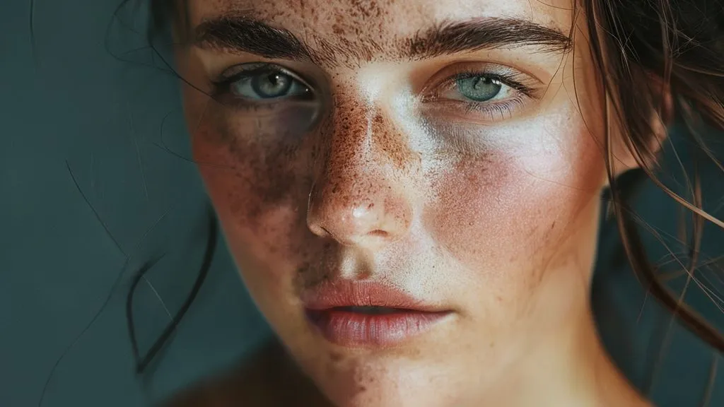
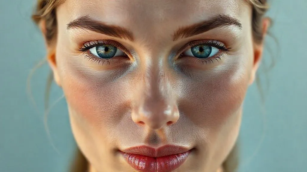
Your email address will not be published. Required fields are marked *