

How do streetwear brands sustain bold print trends without quickly dating?
The challenge of keeping bold prints relevant in streetwear without them quickly dating is one I've observed closely for over a decade. It's a tightrope walk between embracing transient hype and cultivating enduring appeal, but the most successful brands understand that true longevity isn't about avoiding boldness, but rather mastering its strategic deployment. In my experience, the foundational secret lies in a brand's unshakeable **DNA and narrative**. A print isn't just a design; it's a visual manifestation of a brand's ethos, its history, and its community. When a print is deeply embedded in this identity, it transcends mere trend status.- Stüssy's Script Logo: What began as a surf-inspired scribble became a global emblem, continuously reinterpreted but always recognizable, because it embodies the brand's original counter-culture spirit.
- Supreme's Box Logo: This seemingly simple design isn't just a logo; it's a badge of belonging, steeped in skate culture and a disruptive attitude. Its power comes from its consistent story, not just its aesthetic.
- Restrained Color Palettes: Brands often use a limited, cohesive color scheme for their bold prints across seasons, allowing the print's form to shine without being overwhelmed by a chaotic spectrum.
- Modular Application: Instead of an all-over print, a bold motif might be strategically placed on a single panel, a pocket, or as a subtle lining, making it an accent rather than the sole focus.
"The true artistry of a timeless bold print isn't in its initial shock value, but in its ability to reveal new layers of appeal with each wear, seamlessly integrating into diverse personal styles."Streetwear thrives on newness, yet enduring brands master **iteration over constant revolution**. They don't discard successful motifs; they evolve them, offering fresh perspectives on established visual languages. This builds a recognizable visual lexicon that resonates over time.
- BAPE's APE CAMO: While new colorways and variations emerge constantly, the core motif remains instantly identifiable, building on its rich legacy rather than abandoning it. Each new iteration reinforces the original.
- KAWS's Companion: This character, across various collaborations and mediums, retains its core design but is continuously recontextualized, proving that a strong concept can be endlessly reinterpreted without losing its essence.
Frequently Asked Questions (FAQ)
One of the most frequent inquiries I receive centers around the crucial distinction between a truly timeless bold print and a fleeting trend. In my experience, timeless prints possess a foundational design integrity, often drawing from classic motifs or abstract concepts that resonate universally, or they are deeply intertwined with a brand's core narrative and identity. They evolve slowly, if at all, becoming iconic.Conversely, trendy prints are typically reactive, designed to capitalize on a specific cultural moment, a viral aesthetic, or a short-lived buzz. They burn brightly for a season or two but quickly fade into obsolescence. Think of BAPE's APE HEAD camo; it's a foundational print that has adapted across decades, becoming synonymous with the brand. Compare that to a graphic tied to a specific internet meme from last year – one is an icon, the other a relic.
Another common question is how established streetwear brands successfully iterate on a signature print without diluting its original impact. This is a masterclass in controlled evolution, a delicate balance of novelty and recognition. Brands achieve this by playing with several key elements:
- Scale and Placement: Adjusting the size of the print or its position on a garment offers a fresh perspective without altering the core design.
- Colorways and Finishes: Introducing new color palettes, or experimenting with metallic, reflective, or textured finishes, can dramatically refresh a familiar graphic.
- Material Application: Applying the print to different fabrics or garment types – from tees to outerwear, accessories, or even home goods – expands its reach while maintaining its essence.
- Subtle Deconstruction/Reconstruction: Sometimes, a brand might subtly break down or reassemble elements of the print, creating a 'remixed' version that hints at the original without being identical.
It’s much like a classic song being remixed; the core melody is still there, but the instrumentation and arrangement offer a new listening experience. Stüssy has consistently excelled at this with their various script logos and iconic graphics, keeping them fresh for generations of fans.
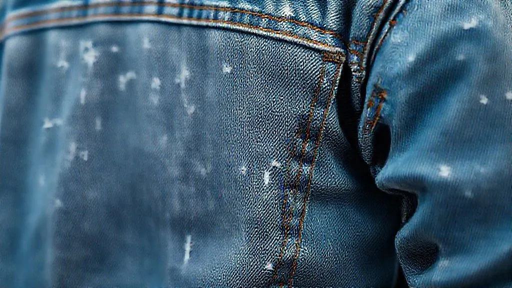
The role of fabric quality and garment construction in a print's perceived longevity cannot be overstated. A groundbreaking print on a shoddy garment that loses its shape, fades, or unravels after a few washes immediately undermines any claim to timelessness. The canvas is as crucial as the art itself.
"In streetwear, quality isn't just about durability; it's about conveying a sense of value and permanence that elevates the print from a mere graphic to a cherished piece of design."
Premium heavyweight cotton, meticulously stitched seams, and advanced printing techniques – like discharge printing where the dye is removed from the fabric to create the print, or high-density screen printing that gives a raised, tactile feel – all contribute to a print feeling integrated and robust. Brands like Noah or Palace understand that a quality base garment makes the print feel substantial and worthy of investment, ensuring it stands the test of time, both physically and aesthetically.
When it comes to color palettes for timeless bold prints, while vibrancy is often a hallmark, true longevity frequently stems from versatility. In my experience, prints rooted in earth tones, monochromatic schemes, or expertly balanced classic primary/secondary combinations tend to endure far longer than hyper-seasonal neons or fleeting pastel trends. These palettes offer broader appeal and easier integration into diverse wardrobes.
Consider the power of a bold graphic rendered in stark black and white, or a complex pattern using only shades of grey and an accent color. This allows the intricate design of the print itself to be the star, rather than relying on a momentarily popular color scheme. Even brands celebrated for their vibrant graphics, such as Brain Dead, often anchor their most enduring pieces with more subdued backgrounds or employ a limited, cohesive color story within the print, making it feel intentional and less disposable.
For emerging streetwear brands, the biggest mistake I consistently see when developing bold prints is prioritizing immediate "hype" or chasing fleeting trends over cultivating a unique brand identity and foundational design principles. This leads to prints that are indistinguishable, easily forgotten, and ultimately contribute to a brand's short lifespan.
Instead, focus on creating prints that tell *your* brand's story, reflect *your* unique perspective, and resonate with *your* core audience. Don't just slap a trendy graphic on a blank; ask yourself:
- Does this print genuinely represent our brand's ethos?
- Is it distinctive enough to stand out in an oversaturated market?
- Does it offer a narrative or aesthetic that can evolve with us?
Authenticity is the ultimate currency in streetwear. Brands that build a distinctive visual language from day one, rather than mimicking others, are the ones whose bold prints become timeless staples.
What makes a bold print timeless in streetwear?
In my fifteen years immersed in the streetwear landscape, I've seen countless bold prints come and go, vanishing into the archives of fleeting trends. Yet, a select few achieve an almost mythical status, transcending seasons and remaining relevant for decades. The secret isn't just about being eye-catching; it's about a confluence of deeper design principles. What truly makes a bold print timeless in streetwear boils down to its **authenticity and inherent storytelling**. It's not enough to simply replicate a popular motif or throw a loud graphic onto a tee. A print must possess a soul, a unique point of view that feels organic to the brand and its ethos. A common mistake I see emerging brands make is chasing current aesthetics without understanding their genesis. Timeless prints don't just reflect trends; they often *start* them or tap into a deeper cultural current that endures. Think of BAPE’s iconic Ape Head camo – it was distinct, instantly recognizable, and deeply integrated into the brand’s identity from day one. Here are the critical elements that, in my experience, elevate a bold print from a seasonal hit to an enduring classic:-
Originality and Distinctiveness: The print must be genuinely unique, not a derivative. It needs to establish its own visual language, setting it apart from everything else on the market. This often means taking risks and forging an unconventional path.
-
Narrative and Context: A print with a story, a message, or a specific cultural reference resonates far longer. Whether it’s an homage to a subculture, a political statement, or a personal artistic expression, depth creates lasting connection. Stüssy’s hand-drawn script, for instance, carries the legacy of surf, skate, and club culture within every stroke.
-
Strategic Versatility: While bold, a timeless print shouldn't be so overwhelming or specific that it can only be worn one way. It needs to possess a certain adaptability, allowing it to be styled across different outfits and occasions without losing its impact. This doesn't mean it's bland, but rather thoughtfully designed for integration.
-
Quality of Execution: Beyond the design itself, the technical application is paramount. A high-quality print that doesn't fade, crack, or peel after a few washes signals durability and respect for the consumer. The choice of fabric also plays a huge role; a bold graphic on a premium garment instantly elevates its perceived value and longevity.
-
Brand DNA Alignment: The print must feel like an organic extension of the brand’s identity. It should reinforce what the brand stands for, its values, and its aesthetic vision. When a print feels out of place, it disconnects from the brand narrative and struggles to achieve enduring status. Palace's Tri-Ferg logo, for example, is inherently tied to their skate roots and irreverent British sensibility.
In essence, a truly timeless bold print in streetwear isn't just seen; it's felt. It communicates without words, carrying a legacy and an attitude that transcends the fleeting whims of fashion. It’s an investment in a brand’s identity, not just a seasonal trend statement.
How do material choices impact the longevity of print trends?
From my vantage point, after years immersed in the fabric of streetwear, the choice of material isn't merely a backdrop for a print; it's the very foundation upon which a design's legacy is built. What many emerging brands overlook is that the fabric acts as the **canvas** for your artistic vision, and a poor canvas will inevitably lead to a short-lived masterpiece.I've witnessed firsthand how a bold graphic on a flimsy, low-quality cotton tee can look incredible for two washes, only to crack, fade, and distort into an unwearable mess. Conversely, the same print on a meticulously selected heavy-gauge cotton or a finely tuned poly-blend can withstand years of wear, retaining its vibrancy and integrity.
The **fiber structure** of a chosen material critically impacts how print inks or dyes adhere and settle. Natural fibers like cotton or hemp, with their absorbent qualities, can deeply soak up dyes and water-based inks, resulting in prints that become part of the fabric itself, rather than merely sitting on top.
However, not all natural fibers are created equal. High-quality, **long-staple cotton** offers a smoother surface and stronger fibers, minimizing pilling and providing a more stable base for detailed prints compared to coarser, short-staple alternatives that can quickly degrade.
Synthetic materials, primarily **polyester and its blends**, present a different set of advantages, especially for specific print techniques. For instance, sublimation printing, which chemically bonds the dye to the polyester fibers, creates incredibly vibrant, full-color designs that are virtually impervious to cracking or fading.
A common mistake I see is brands trying to force a print method onto an incompatible fabric. Screen printing, while versatile, requires a certain **fabric stability and porosity**. Attempting a heavy, plastisol screen print on an overly stretchy or delicate synthetic can lead to rapid cracking and peeling as the garment moves and stretches.
Consider the following material considerations for print longevity:
- Heavyweight Cotton (220 GSM+): Ideal for screen printing and direct-to-garment (DTG). Its density helps absorb ink deeply, and its robust structure resists distortion, ensuring prints hold their shape. Think classic Stüssy tees; they endure.
- Polyester/Cotton Blends (60/40, 50/50): Offers a balance. Cotton provides breathability and a natural feel, while polyester adds durability, wrinkle resistance, and can enhance vibrancy, especially with hybrid print methods.
- 100% Polyester or Performance Blends: The champion for sublimation printing. Perfect for all-over prints, intricate patterns, and athletic-inspired streetwear where durability and moisture-wicking are key. The print literally becomes part of the fabric.
- Fleece (French Terry, Brushed Fleece): Excellent for puff prints, flocking, and embroidery due to its substantial weight and soft texture. It provides a luxurious backdrop that can elevate tactile print experiences.
The true secret to timeless prints isn't just the design itself, but the foresight to choose a canvas that can carry that design through countless wears, washes, and the relentless march of time. Material choice isn't an afterthought; it's the bedrock of a print's enduring appeal.
The longevity of a print isn't solely about the initial application; it's about how the chosen material interacts with the print over the garment's entire lifecycle. A high-quality fabric will maintain its structure and color, supporting the print and preventing premature fading, cracking, or pilling that can render a design unwearable.
In my experience, investing in premium materials upfront, even if it adds a few dollars to the production cost, pays dividends in brand reputation and customer loyalty. When a customer's favorite graphic tee still looks sharp after years, they attribute that quality to your brand, fostering a deeper connection.
Can archival prints be successfully re-released in streetwear?
Absolutely, archival prints can be successfully re-released in streetwear, but in my experience, it's far from a simple copy-and-paste job. This isn't just about rummaging through old hard drives; it's about understanding the core essence of what made that print iconic in the first place and then reinterpreting it for a contemporary audience.
The true art lies in the **narrative**. A print isn't just a pattern; it's a piece of history, a cultural timestamp. When a brand decides to bring back an archival print, they must tell its story – why it mattered then, and why it's relevant now. Without this rich context, it risks feeling like a cheap throwback, devoid of soul.
Furthermore, **recontextualization** is paramount. A print from the 90s, for instance, might have adorned oversized, baggy silhouettes. Simply slapping it onto the exact same cut today might feel dated. Brands need to consider modern fits, fabric technologies, and the broader aesthetic landscape. Sometimes, it means subtly updating the color palette, scaling the print differently, or applying it to an entirely new garment category to inject fresh life.
Here are critical considerations I've seen brands master when resurrecting classics:
- Authenticity: Does the re-release genuinely align with the brand's current identity, or does it feel like a cash grab? Consumers are highly attuned to inauthenticity.
- Scarcity and Exclusivity: Limited drops or special collaborations can amplify desirability, transforming a re-release into an event rather than just another product.
- Quality of Execution: The reproduction must meet or exceed contemporary quality standards. Poor print fidelity or cheap materials will instantly devalue the archival appeal.
- Audience Resonance: Is this for the OG fans who remember the original, or is it an educational piece for a new generation? Understanding your target helps tailor the messaging and distribution.
Look at brands like **Stüssy** or **Supreme**. They consistently dip into their extensive graphic archives, but they don't just regurgitate. Stüssy, for example, might bring back a classic tribal print, but apply it to a modern workwear jacket or an unexpected accessory, giving it a fresh context. Supreme's constant re-imagining of their iconic Box Logo across different materials, textures, and collaborations is a masterclass in keeping an archival print perpetually relevant and desirable.
"Releasing an archival print isn't about nostalgia alone; it's about proving the print's enduring power and adaptability. It's a test of its timelessness, not just its past popularity."
A common mistake I see is a lack of foresight regarding market saturation. While an initial re-release might be successful, over-releasing the same archival print too frequently, or without significant variations, can quickly diminish its special appeal and perceived value. It's a delicate balance between catering to demand and maintaining exclusivity.
In essence, successfully re-releasing archival prints requires a deep understanding of brand heritage, a keen eye for contemporary trends, and a strategic approach to storytelling and market deployment. When done right, it not only celebrates the past but also solidifies the brand's enduring relevance in the present and future.
Reading Recommendations:
- The Ultimate Guide: How to Make Basic Outfits Look Effortlessly Chic
- Safeguarding Biometrics: 7 Pillars for Secure Personalized Fashion
- Beat the Shine: The Ultimate Makeup Guide for Oily Skin This Summer
- Quantify ROI: 5 Steps for Predictive Analytics in Fashion Retail
- The Unseen Value: Best Heritage Luxury Brands for Investment Revealed
Key Points and Final Thoughts
After years in this game, it's clear that the true genius behind a timeless bold print isn't just the design itself, but the ecosystem built around it. It's about understanding that a print, no matter how audacious, must serve a larger purpose within the brand's narrative and aesthetic.
In my experience, the brands that truly nail this understand that a bold print's longevity hinges on a few non-negotiable pillars:
- Intentional Design Language: Every line, every color choice, every graphic element must contribute to a cohesive brand identity, not just stand out for the sake of it.
- Uncompromising Quality: A print can only truly endure if the garment it adorns is built to last. Fading, cracking, or poor fabric quality are the quickest routes to irrelevance.
- Narrative Depth: The most iconic prints tell a story, whether it's cultural commentary, an homage, or a reflection of a specific subculture. This resonance builds an emotional connection.
- Strategic Versatility: Timeless prints often work across various silhouettes and can be styled in multiple ways, allowing them to adapt to evolving trends without losing their core appeal.
A common mistake I see emerging brands make is chasing trends without grounding them in their core identity. This leads to prints that are fleeting by nature, quickly becoming dated. Timelessness isn't about being immune to trends, but about filtering them through a distinct brand lens.
Another critical misstep is overlooking the garment itself. A fantastic print on a cheap, ill-fitting tee will never achieve iconic status. The print and the garment must elevate each other, creating a synergistic effect where the whole is greater than the sum of its parts.
A bold print in streetwear isn't merely a decorative element; it's a brand's visual signature, a conversation starter, and often, a piece of wearable art. It's not a scream for attention; it's a confident whisper of identity. Treat it with that reverence.
Looking ahead, the landscape continues to evolve. Brands that will truly keep their bold prints timeless will also integrate principles of sustainability and ethical production. Consumers are increasingly discerning, and a print’s legacy now extends beyond its visual appeal to its entire lifecycle and impact.
Focus on building a loyal community around your brand's narrative. When people feel a connection to the story behind the print, they become ambassadors, extending its relevance far beyond seasonal drops. This grassroots advocacy is invaluable.
Finally, remember that timelessness doesn't mean stagnation. It means understanding your core aesthetic so deeply that you can continually reinterpret, refine, and even subtly subvert your signature prints, keeping them fresh without losing their essence. It's a delicate dance between innovation and tradition.
Ultimately, the secret to timeless bold prints in streetwear boils down to a profound understanding of your brand's soul, meticulous execution, and a genuine connection with your audience. It's a marathon, not a sprint, built on authenticity and enduring quality.

Your email address will not be published. Required fields are marked *